This is not my typical project, and so I wanted it to be documented. I type this with a little glee.
First a little background: Andy Bassford is no ordinary guitarist, he is a bonafide reggae legend, and grammy award winning artist. His story is not only remarkable, it is downright fascinating (which I encourage you to read.)
I sing & play guitar in local venues in and around New York, and on a few occasions I play with a talented woman, Kristina Marie. Kristina Marie introduced me to Andy Bassford some years ago, and when she explained who he was, my mind was blown. Andy plays guitar like Chuck Berry says “ringing a bell.” He is also kind, gracious and a consummate gentleman.
When I plucked up enough courage to ask Andy if he would give me some guitar lessons, he looked at me, gave me a slight grin, and said “Sure! but you have to come to me.” Getting lessons from Andy has opened my eyes, my skills and it is one of the most enjoyable hours I could spend each week. During one of our guitar lessons, Andy asked if I would be interested in throwing my hat in the ring, against some competition, to design of his upcoming Album “The Harder They Strum.” I jumped at the chance.
The Harder They Come
Andy explained that his project was based upon an album called “The Harder They Come,” which had inspired him to begin his career as a guitarist. The album is a movie soundtrack for a 1972 Jamaican crime film directed by Perry Henzell, co-written by Trevor D. Rhone, and stars Jimmy Cliff.
Although I knew who Jimmy Cliff was, I walked out of that lesson and dove into the research for “The Harder They Come,” album cover. Andy reminded me that I “may not get the gig” but I was determined and hopeful that he would trust me with his opus
When Andy called to award me the Gig, I found myself surprised to feel as excited as I was. Partially because I love music, but also because I knew how much this album meant to him. I wanted share my talents with Andy, the way he shares his talents with me. In my mind it was a small way of repaying him.
He explained an artist had been working on an illustration for the cover, that was inspired by the original album artwork but it wouldn’t be ready for a couple of weeks, and while he wanted to pay homage to the original, he wanted to make the cover his own.
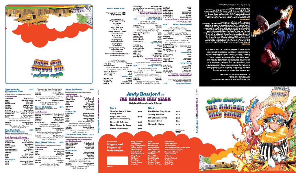
When I saw the original album cover I was inspired, it was a classic 1970’s piece of graphic design. Hand drawn illustrations, hand drawn type and bright colors all trying to capture the action of the movie. I began immediately searching for all of the elements I would need to recreate the typography on the album, while I awaited the illustration to be delivered.
I performed an online search and found a number of images of the original album cover. I downloaded a few to compare each against each other, and once I gathered the best specimen’s, I began by tracing the original album lettering. Artwork from this era was always hand drawn, and in this case the artist had used the fonts Cooper Black and a hand drawn typeface that could only be recreated by hand.
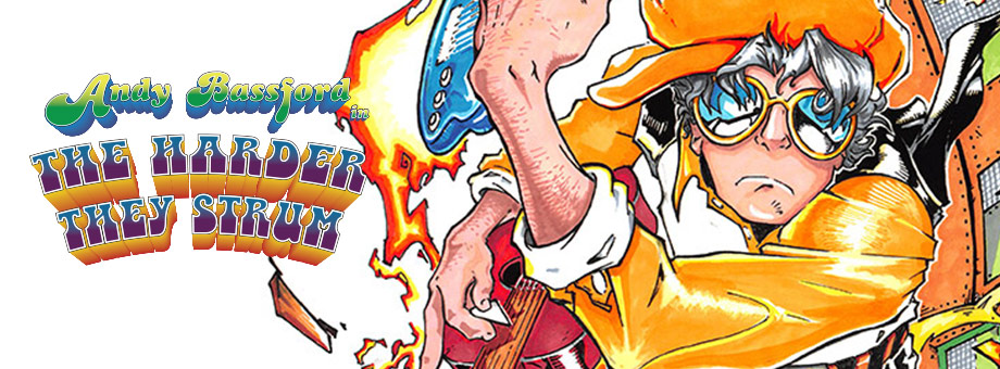
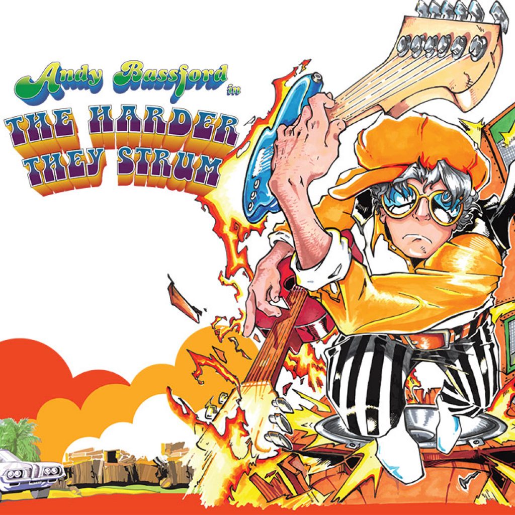
The illustration that I would need to include in the layout was created by an artist known as Earthman Maxwell, whom Andy referred to as just “Earth.” The illustration was excellent, and hand drawn.
The illustration is of Andy Bassford, with his electric guitar in one hand and his acoustic guitar in the other, dressed in vintage clothes, and wearing the black and white pants that were worn on the original album artwork.
It was perfect.
Bringing it all together
My process for any project is iterative, and this was no exception. This meant including Andy in the process in some early iterations of the layout, explaining my ideas and process as I went.
The display of the full cast of credits for each song on the album was a requirement, and on this small jewel case it would be challenging. It was the kind of challenge that I love.
The final layout is an exercise in typographic precision. I pushed the legibility edge of each typeface, using every tool I could from, kerning and color to tracking and leading, arranging the huge amount of content onto the six panels. The final result really pleased Andy, and that pleased me.